Configuration
Please Note: This page is about the configuration page but is not a guide on how to make an advanced configuration. For guides on making configurations please check out: https://wiki.skaarhoj.com/books/blue-pill-reactor/chapter/advanced-configuration
The Configuration page is described how it appears starting with Reactor v2.0.
For a more customized configuration either self constructed or to modify a default configuration used in the Mapping section it is necessary to move off of the Home page and into the Configuration page.
There are three main parts of the Configuration page, however only two of them are directly presented, Controller section for an overall view of the panels and the Inspector where parameters and behaviors are assigned to the hardware components. The third, more advanced section, is the Tree view (not pictured) where you can see the whole mapping of the configuration and gives more advanced ways to configure the panel.
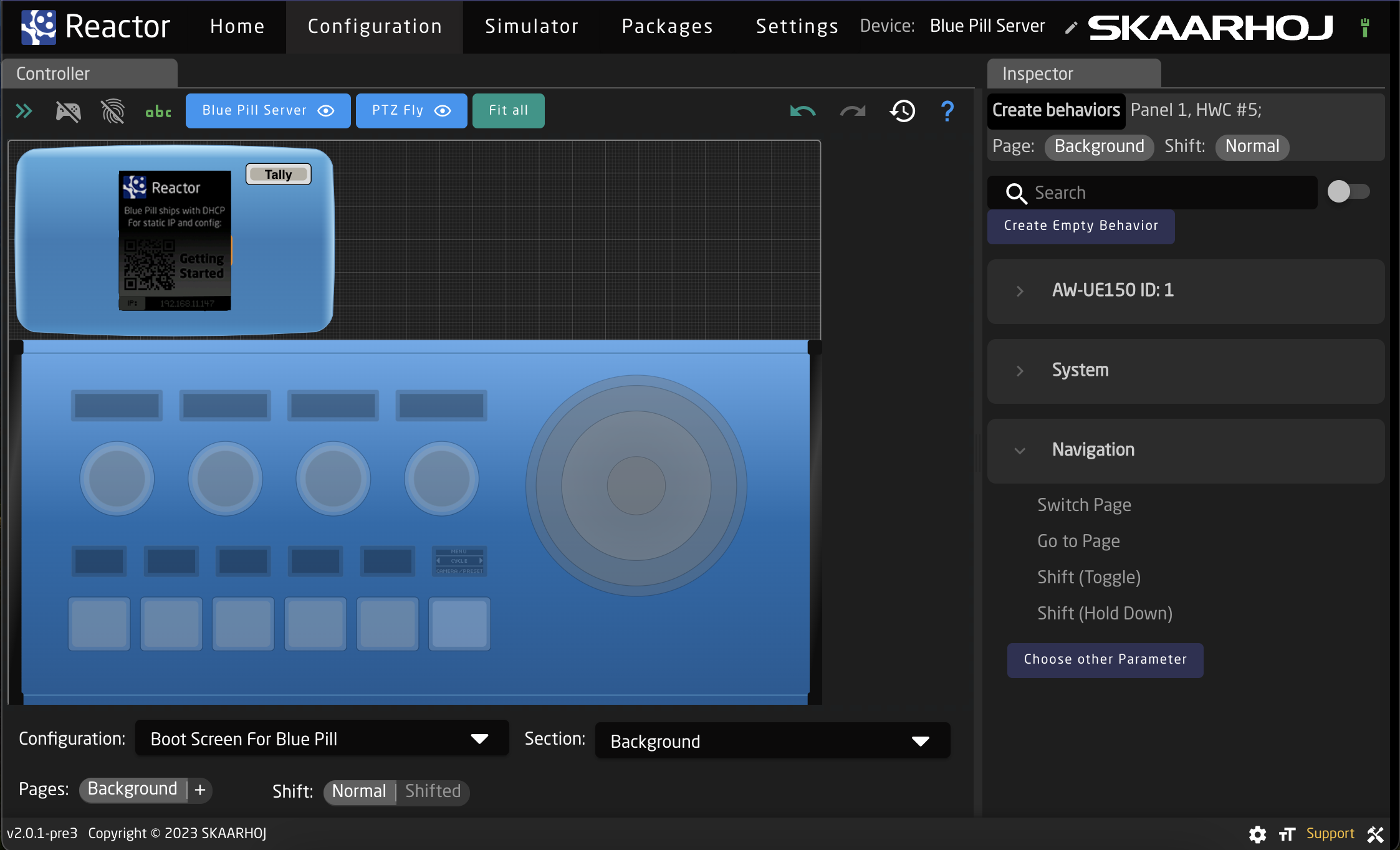
Controller
The Controller sections is full of many tools to allow for navigating through the configuration and even using a fully functional simulated version of the panels.
Please note, this section may act or look different when the Tree section is open.
Starting at the top of the page, there are a few different ways to interact with the interface.

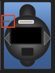
| Arrows Icon | Toggles open/close the Tree View. (see Tree section for more information) |
| Controller Icon | Toggles on/off simulation mode. When on, the graphical view of the panels acts as a real panel. When simulation mode is not on, it is in configuration mode. |
| Fingerprint Icon | Toggles on/off listening mode. When on, interacting with a physical hardware component on the Skaarhoj panel will open that component in the Inspector. |
| ABC Icon | Toggles on/off the text labels in the graphical view of the panels. |
| Panel Names | Centers graphical view on selected panel. |
| Eye Icon | Toggles on/off the view of the specific panel in the graphical view. Button turns grey when panel is not visible. |
| Fit All | Positions graphical view to show all visible panels. |

| Back Arrow Icon | Undoes the last change made in the Inspector |
| Forward Arrow Icon | Redoes the last change made in Inspector |
| History Icon | Opens the History View. See History View page for more information. |
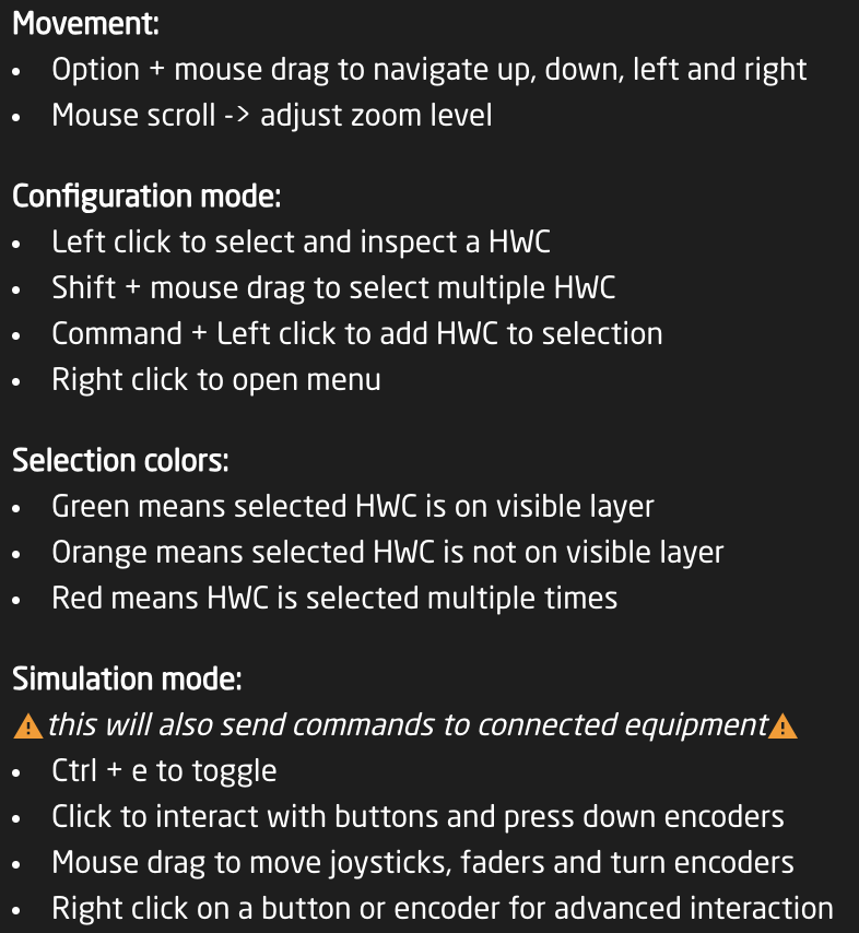
| Question Mark | Opens the graphical view movement and color guide. See image below. |
Graphical View Image and Color Guide:
The interactive graphical view displays the panels in the current project in their current state on a grid. The layout of the panels on the grid can be adjusted from the Panel Groups interface accessible on the Home page.
Each hardware component of each panel is selectable from the graphical view to interact with, how that behaves is dependent on which mode you have enabled at the top of the Controller section.
Configuration Mode
In configuration mode clicking on one of the hardware components will open that up in the Inspector to the exact place if that hardware component has been created in the associated section of the selected configuration. If it has not been defined in the section for the configuration it will be greyed out.
Right clicking on a hardware component will open an options menu, even if the component has not been created on the section.
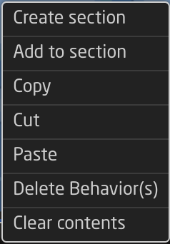
| Create section | Creates a new section in the configuration. |
| Add to section | Adds the hardware component to to the current section. See expanded details below. |
| Remove from section | Removes the hardware component from the current section. |
| Copy | Copies the current configuration of the hardware component to be able to be pasted. |
| Cut | Cuts out the current configuration of the hardware component to be able to be pasted. |
| Paste | Pastes the last copied or cut configuration of a hardware component to the select component. |
| Delete Behavior(s) | Deletes the current behavior or behaviors configured on the component, plus makes it transparent if it is not currently. |
| Clear Contents | Deletes the current behavior or behaviors configured on the component. |
When adding a section a pop up window will be presented where it is possible to define certain details of the section.
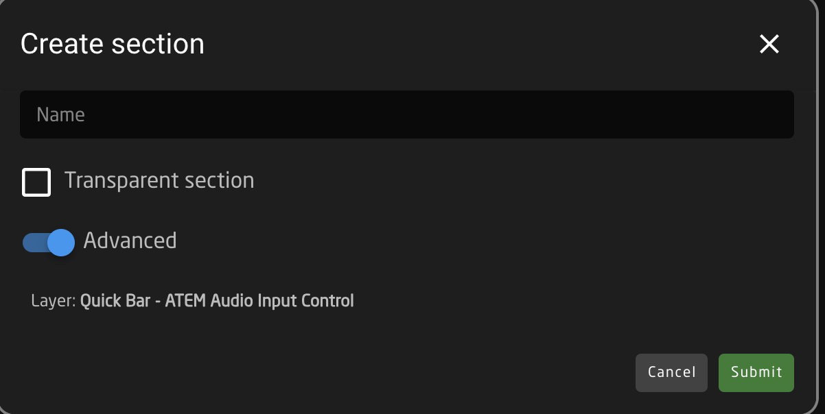
| Name | User defined name for the created section. |
| Transparent section | Selecting Transparent section will allow for behaviors configured on a lower layer of the tree for that hardware component to show through. If not transparent, the hardware component will remain blank unless configured. |
| Advanced | Toggles on/off Advanced for the section creation tool. |
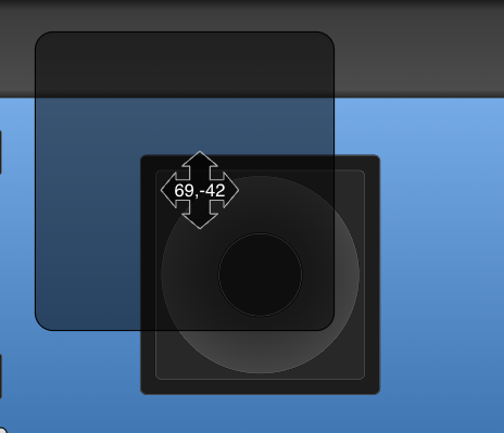
| Layer Selection | Allows for the selection of which layer in the tree the section is created on. Available only with Advanced toggled on. See image below. |
| Cancel | Cancels the creation of a new section. |
| Submit | Submits and saves the new section. |
Layer selection filter for the section creation tool, allows for the selection of any layer in the tree for the current project. 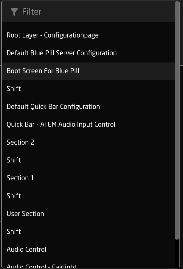
Simulation Mode
In simulation mode, the graphical view works actually controls the panel and all connected devices. In this mode the entire graphical view will have a yellow dotted line around it.
The individual components will also have indicators on them of their use. Below is a selection of hardware components in simulation mode.
| Button | Small triangles represent left, right, top edge presses |
|
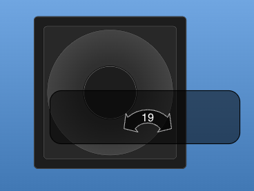
| Encoder and Knobs | Triangles represent direction of turn |
|
| PTZ Joystick Twist, Zoom Rocker, XC8 Shuttle Wheel | Arrows represent direction of twist and number is the speed component value |
|
| PTZ Joystick Up/Down | Arrows represent direction of movement and numbers the component value of X,Y axis |
|
| RCP Joystick Up/Down | Line represents the position of the virtual position of the joystick as it is not a motorized hardware component |
|


Right clicking on a hardware component brings up different options then it does when in configuration mode.
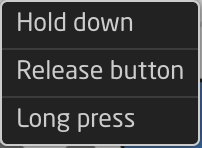
| Hold down | Corresponds to pressing down the button or encoder without releasing it. |
| Release button | Corresponds to releasing the hold down of the button or encoder. |
| Long press | Corresponds to a 1 second long press. |
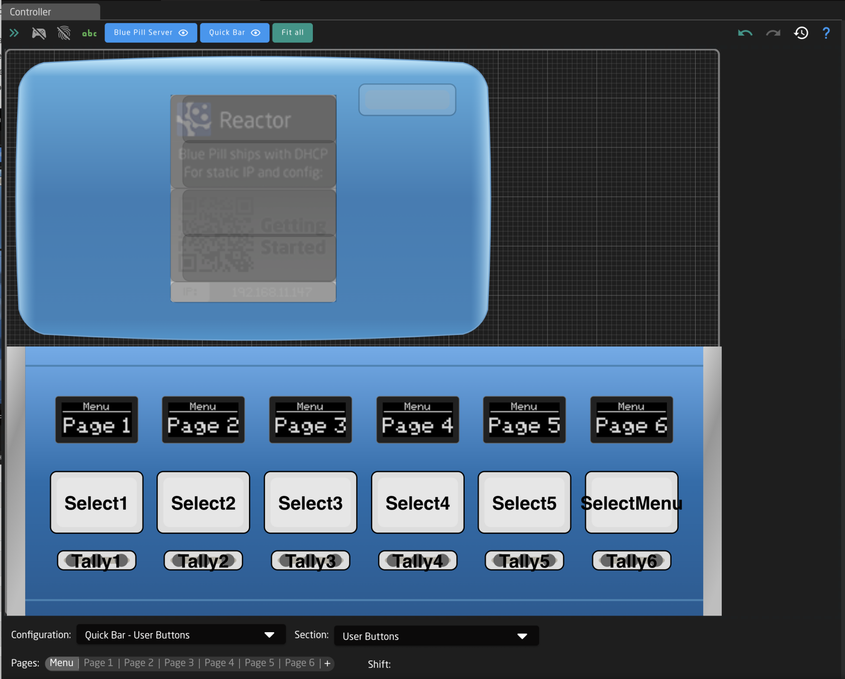
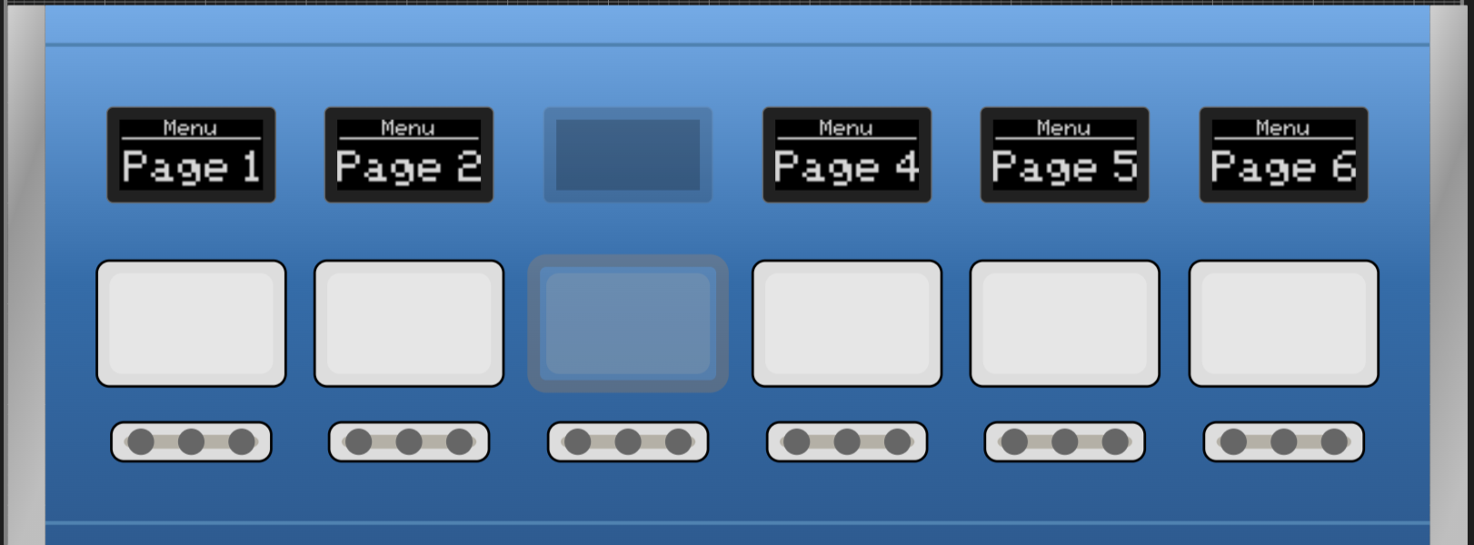
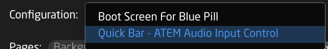
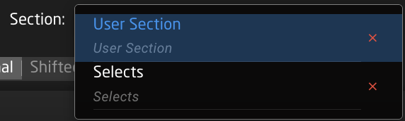
The bottom section of the Controller section is a navigation tool to move around the configuration of each panel.
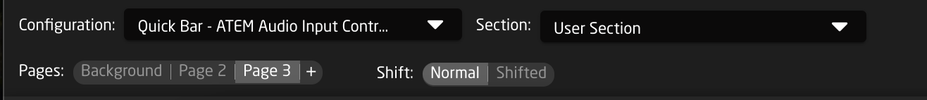
| Configuration | Select between the configuration in the project. The graphical view of the panel associated with the selected configuration will no longer be grayed out. |
|
| Section | Select between the different hardware component sections in the selected configuration. These sections are tied to the configuration, the pages, and the shift levels they were created on. |
|
| Pages | Select between the different page layers of the configuration. Using the + symbol will add more pages. See below for more detail. |
|
| Shift | Select between the different shift layers of the currently selected page. |
|

When creating a new page a pop up prompt will low for the setting of the page name and whether or not the page will be transparent or not. A Transparent page will allow for lower pages or layers in the tree to have their hardware component settings visible or available when on the new page, unless the hardware component is configured on the current layer.
Right clicking on one of the page will also preset a number of options.
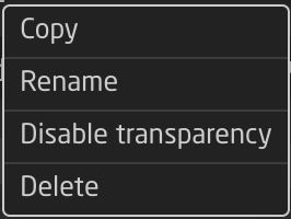
| Copy | Create a duplicate copy of the clicked upon layer. |
| Rename | Rename the clicked upon layer. |
| Disable transparency | Disable the transparency for the clicked upon layer. |
| Delete | Delete the clicked upon layer. |
Inspector
The Inspector is where all the hardware components have their configurations assigned and adjusted. The Inspector section can give a very simple start to getting the configuration going or can be made more complex to create more complex workflows.
Create Behavior
When first configuring a hardware component the Inspector interface the interface will appear as below. This is the Create Behavior Interface. 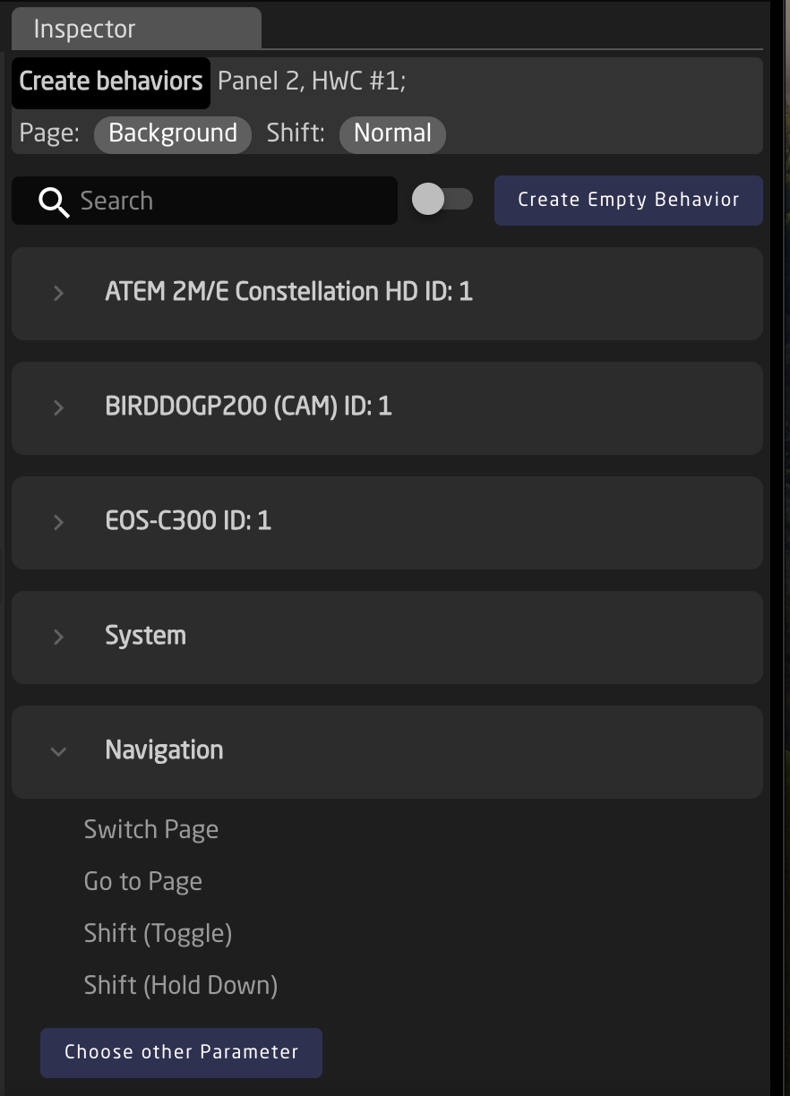
Looking at the top of the section:
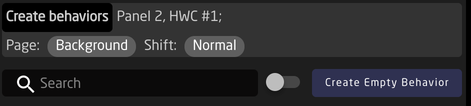
| Create behaviors | The lighter grey section indicates which specific hardware component is going to be configured, and on which configuration page and shift level it will be on. |
| Search | Search for the specific parameter to configure on the button |
| Device Grouping Toggle | Toggle between seeing Create Behaviors per device or per device core. |
| Create Empty Behavior | Skip Create Behaviors to create an empty behavior to fully configure. |
Below the upper section, the Create Behaviors will be available either per individual device or grouped per device core depending on how the toggle is set. Below the devices have been grouped by their device cores.
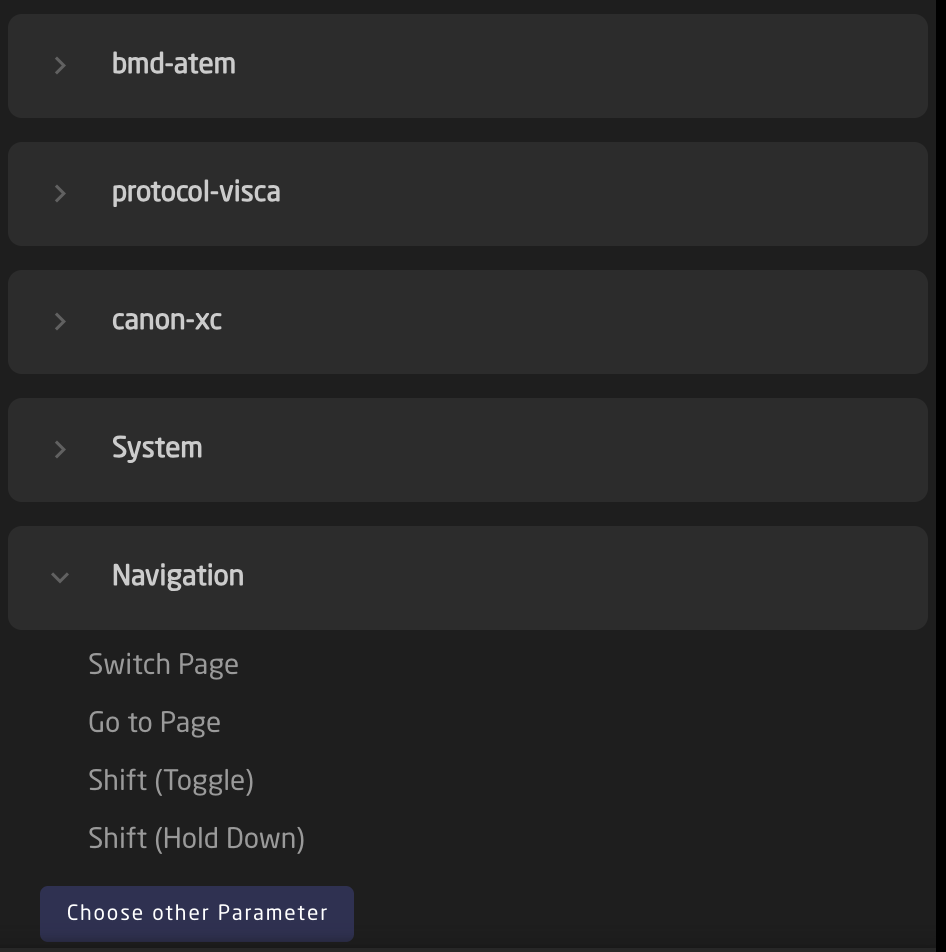
Expanding one of the cores, system, or navigation menus the individual parameters become become selectable.
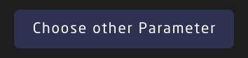
Not every parameter, system setting, or navigation tool is available as a Create Behavior. For those that are not they will need to be self configured. To select an different parameter, select Choose other Parameter.
Full Inspector
Moving in past the simplified Create Behavior interface, the hardware component configurations possibilities become virtually endless in the full inspector. 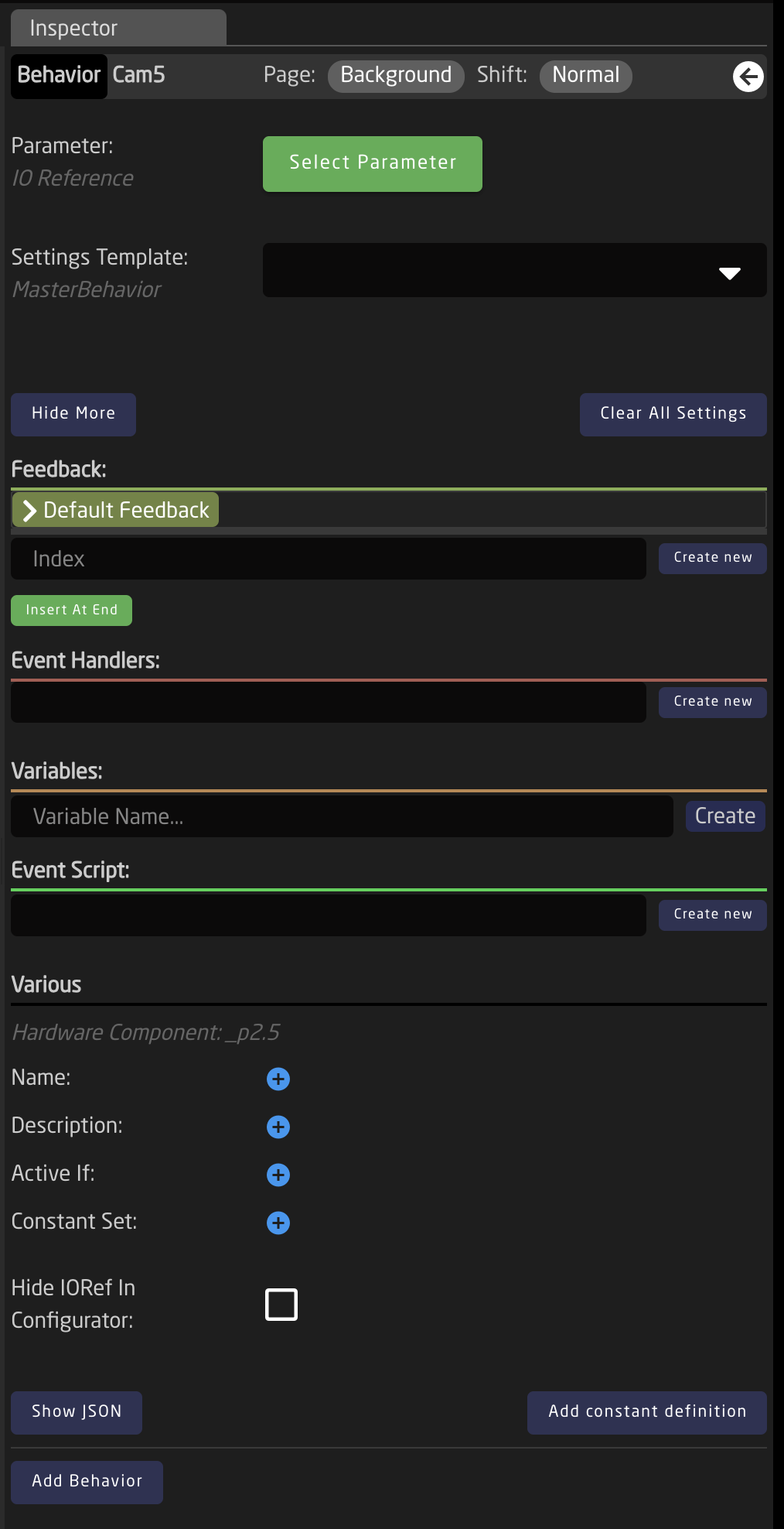
Starting with the top section of the Inspector
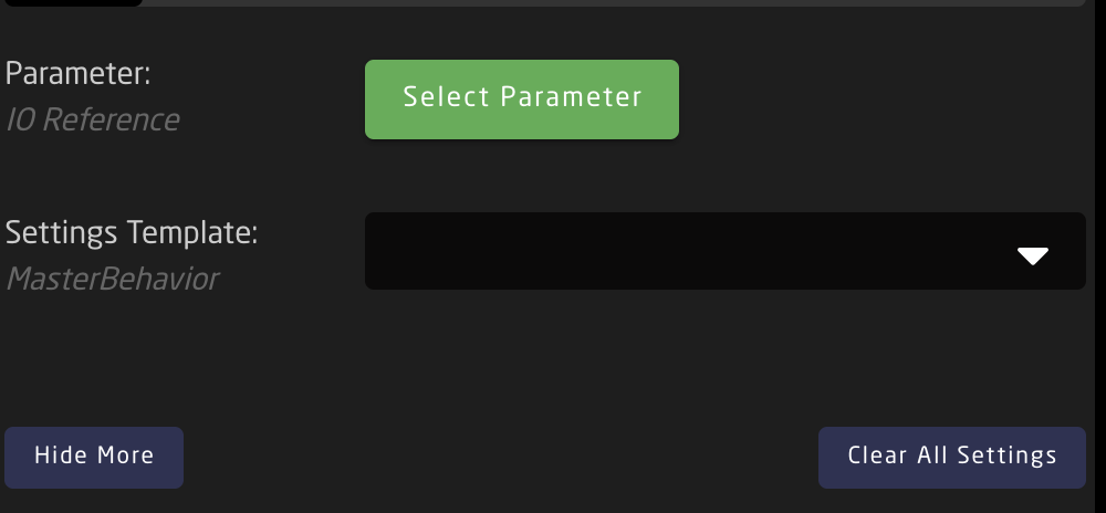
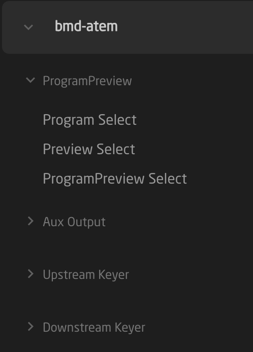
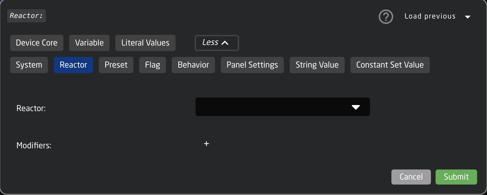
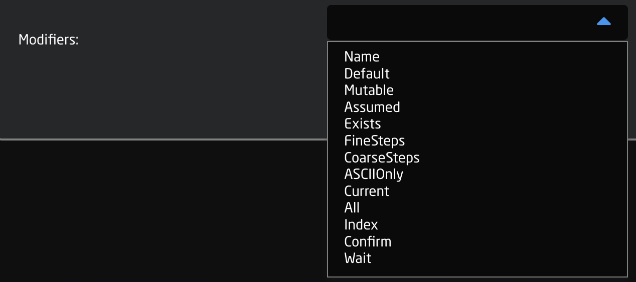
| Parameter | Select what is to be controlled by the hardware component. The parameters have various categories: Device Core, Variable, Literal Values, System, Reactor, Preset, Flag, Behavior, Panel Settings String Value, Constant Set Value; with different further options depending on what is selected.
There is a standard list of available modifiers to add.
There are scenarios where it is not needed to use the Parameter field when configuring a hardware component. |
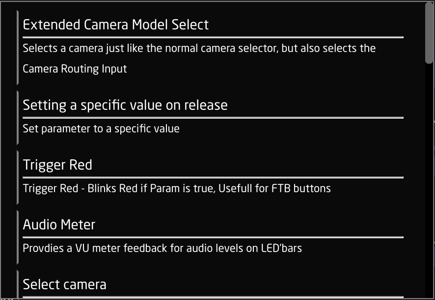
| Settings Template | Predefined templates that can be paired with a parameter for quickly assigning functionality to a hardware component. They can be more generic to work in the same way with various parameters or tailored to specific parameters or device cores. Frequently these are auto selected or suggested when selecting a parameter.
As these are prebuilt templates, they contain information needed for Event Handles and Feedback. There are scenarios where it is not needed to use the Settings Template field when configuring a hardware component. |
| Hide More/Show More | Opens or closes more of the Inspector. |
| Clear All Settings | Clears all the current settings from the Inspector. |
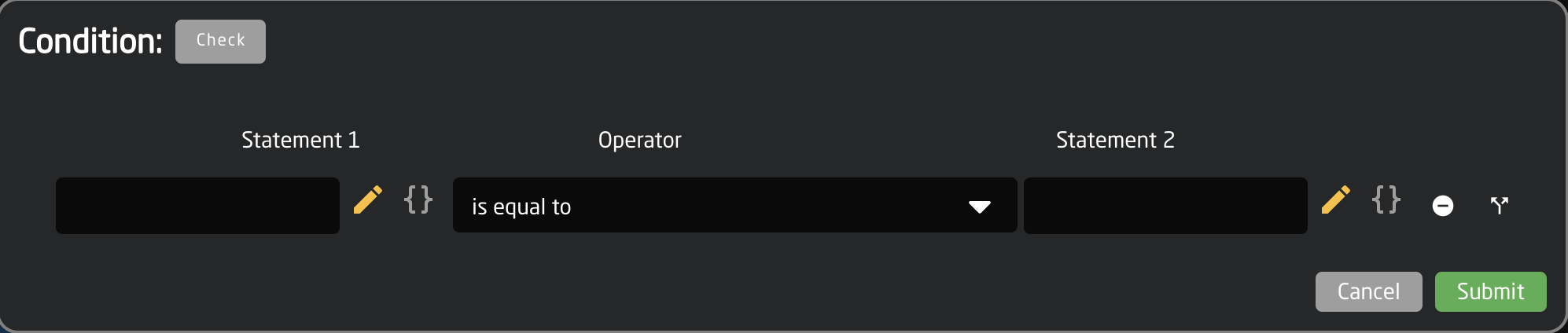
The Feedback section is about how the hardware component looks in terms of OLED display or LED color. There are two types of feedback, Default and Conditional. The default feedback is the main look of the OLEDs and LEDs. The conditional feedback is used when specific Active If conditions are used to change any part of the default feedback. The feedback can be as detailed as desired with no specific field mandatory except Index and Active If for the conditional feedback.
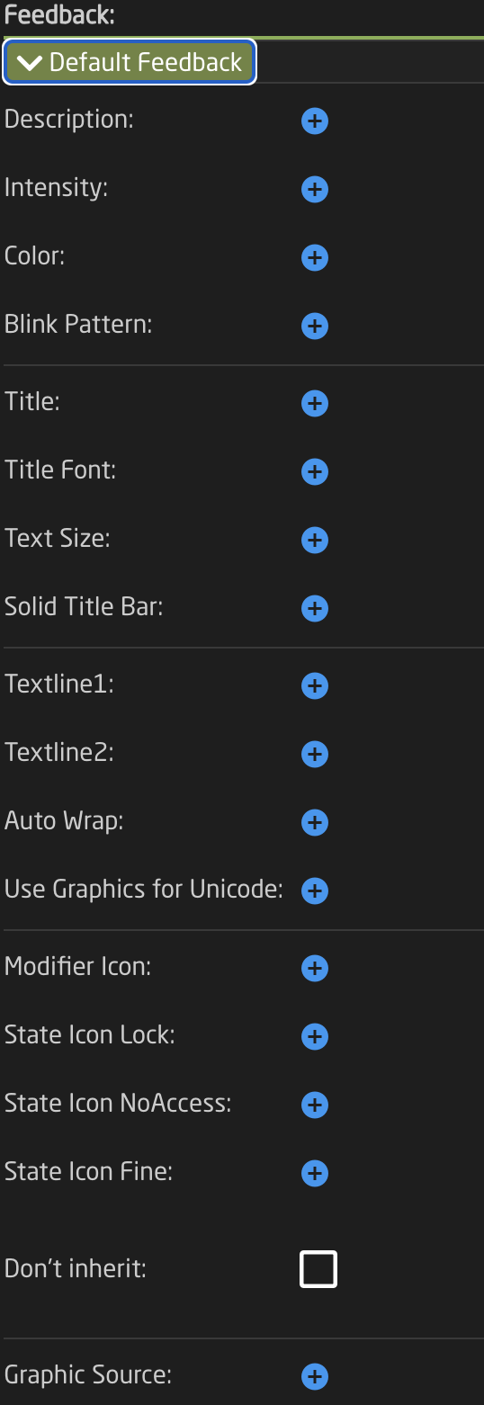
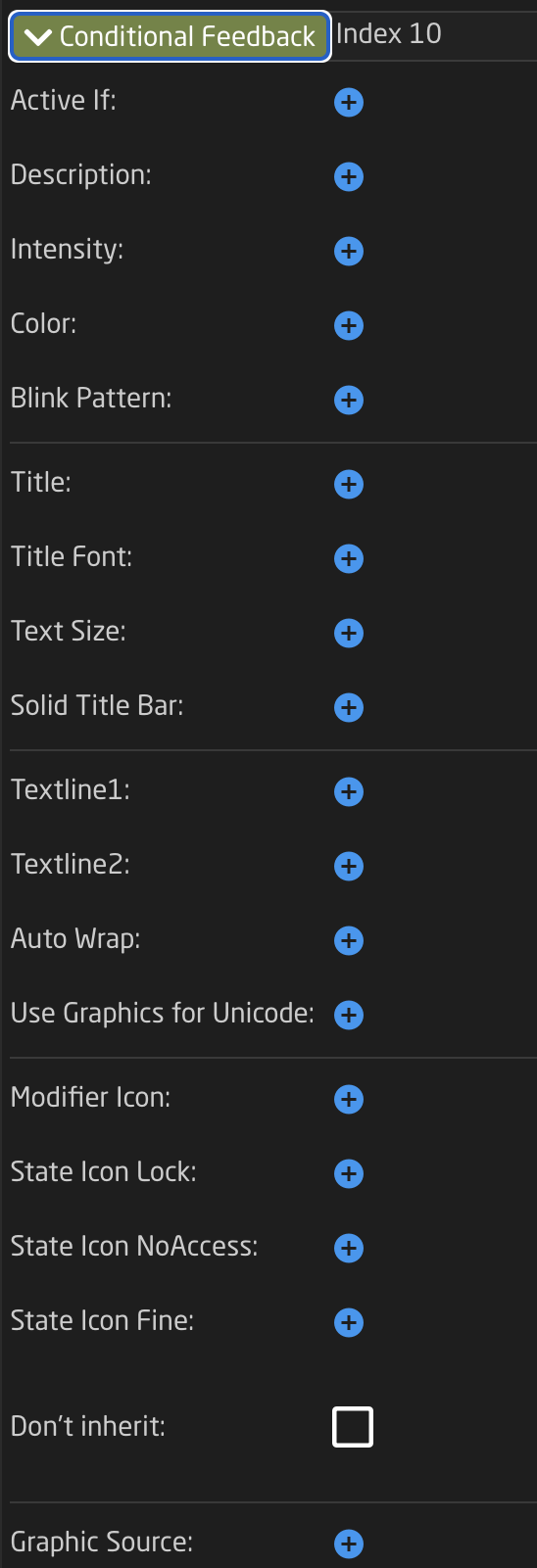
| Index |
Value assigned on feedback creation to rank the feedback's priority with higher values having higher priority in being displayed. |
| Active If |
Conditions that need to be met for the feedback to be active.
|
| Description | Easy to understand text string of the feedback's purpose |
| Intensity | Brightness of the LED feedback; On, Dimmed, or Off |
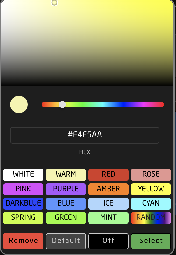
| Color | Hue assigned to the LED feedback. Choose from predefined color, pick on a color wheel, or set based on HEX value.
|
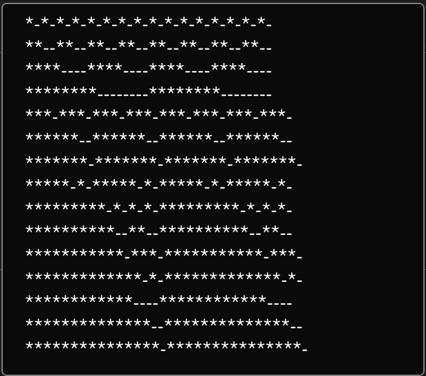
| Blink Pattern | Pattern at which the LED should blink.
|
| Title | Text string for top 1/3 of the display, often used for a title. |
| Title Font | Font used for the title; Default, Bold, Tiny |
| Text Size | Size used for the title; Default (0,0), Small (1,1), Narrow (1,2), Medium (2,2), Large (3,3) |
| Solid Title Bar | Sets title bar's background as while and text color as black for top 1/3 of display; On, Off, No Title |
| Textline 1 | Text string for bottom 2/3 of display if Textline 2 is left blank or middle 1/3 of display if Textline 2 is used. Character length is dependent on display size. |
| Textline 2 | Text string for bottom 1/3 of display. Character length is dependent on display size. |
| Auto Wrap | Used with Textline 1 to split text into 2 lines if it is too long; on, off |
| Use Graphics for UniCode | Allows for text based character outside of the standard English alphanumeric characters. |
| Modifier Icon | Adds a modifier icon to the display; No icon, cycle, Down, Up, Hold, Toggle, OK, Question |
| State Icon Lock | Active If condition to show a lock icon in the display. Overrides the No Access and Fine icons. |
| State Icon No Access | Active If condition to show a no access icon in the display. Overrides the Fine icon. |
| State Icon Fine | Active If condition to show a fine icon in the display. |
| Don't Inherit | Advanced setting to stop the inheritance of the feedback from a parent behavior. |
| Graphic Source | Select graphic for display in place of text based display; Icon, IOReference, QRcode. Icon can be from internal library or uploaded. Additional options may exist within IOReference and QRcode. |
The Event Handlers are used to set exactly how the hardware component operates and performs the action for the parameter.
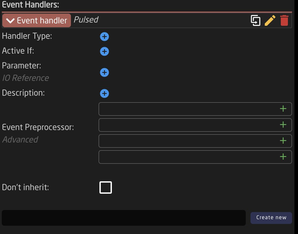
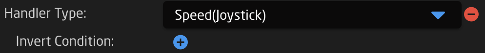
| Handler Type | Sets type of hardware component type for the component to act as; Binary (Button), Pulsed (Encoder, Roller Wheel), Analog (Fader, T-Bar, RCP Joystick), Speed (Zoom Rocker, PTZ Joystick). See below for more detail. |
| Active If |
Conditions that need to be met for the feedback to be active.
|
| Parameter | Parameter to be affected by the event handler. If left blank it will affect the main parameter. |
| Description | Easy to understand text string of the event handler purpose. |
| Event Preprocessor | Transforms incoming trigger type. Advanced |
| Don't inherit | Advanced setting to stop the inheritance of the event handler from a parent behavior. |
| Create New | Create new event handler and set name for it. |
Handler Types
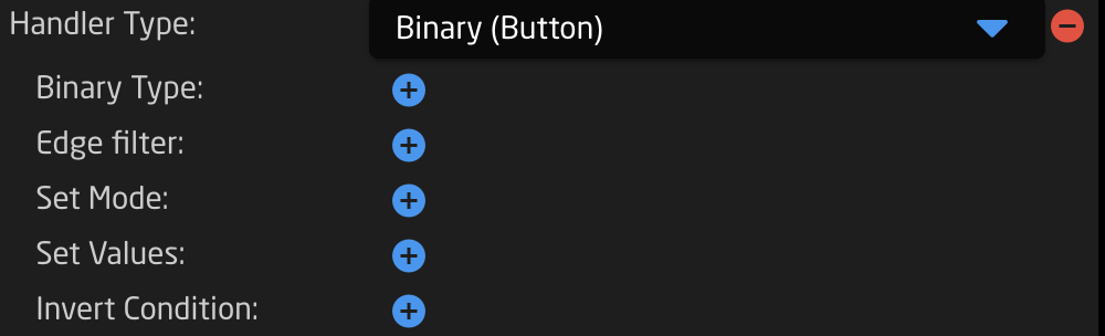
| Binary Type | Which binary the handler responds to: button press, Act Down, or release, Act Up |
| Edge Filter | Which edge of a 4-way button the handler responds to: Any edge, No edge, Top, Left, Bottom, Right, Left & Right, Top & Bottom, Encoder Click |
| Set Mode | Set, Toggle, Add, Remove, Toggle Add/Remove, Cycle Up, Cycle Down, Cycle Up and Roll Over, Cycle Down and Roll Over, Clear, Random, Sequence |
| Set Values | To set a specific value or to copy a value from another parameter |
| Invert Conditions | To set the conditions on which the action will be the invert or opposite |
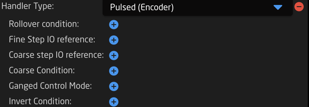
| Rollover Conditions | Conditions for the end value to rollover to the start value when cycling through |
| Fine Step IO reference | Can be a set value for size of a fine step or can be set via na IO reference |
| Coarse Step IO reference | Can be a set value for size of a coarse step or can be set via na IO reference |
| Coarse Condition | Set conditions for switching between coarse and fine mode |
| Ganged Control Mode | Way ganged control works; Set All to First, Change All Relatively |
| Invert Condition | To set the conditions on which the action will be the invert or opposite |
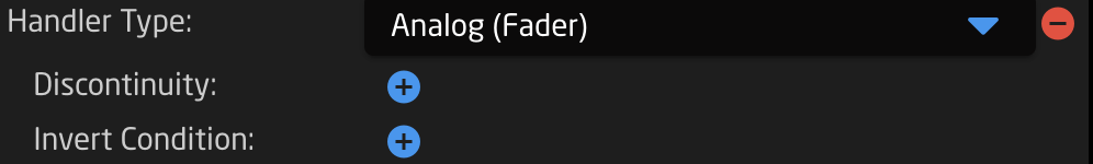
| Discontinuity | Strategy for detecting movement of a hardware component to adjust a parameters via an analog component; Double Linear, Offset, Non |
| Invert Condition | To set the conditions on which the action will be the invert or opposite |
| Invert Condition | To set the conditions on which the action will be the invert or opposite |
Within each type of event handler, there is the Event Preprocessor section for a more advanced configuration of how a hardware component should act by transforming its hardware component type.
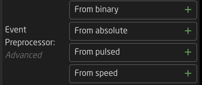
The options available with each preprocessor is dependent on the overall event handler type.
More information on Event Preprocessors coming soon.
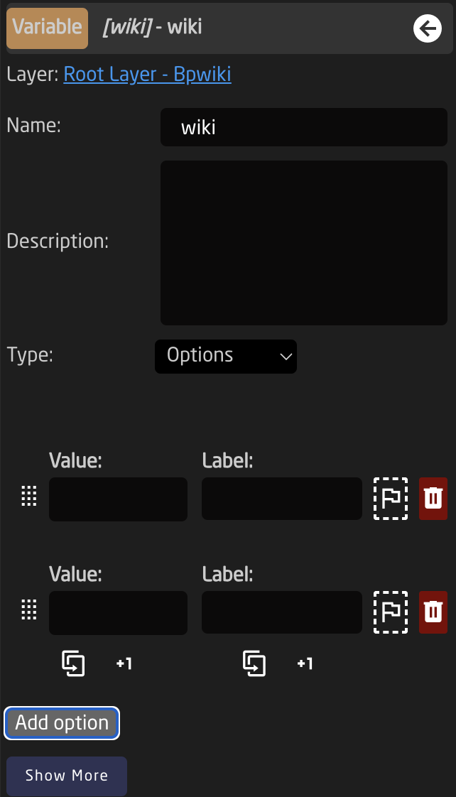
Variables are used in many different ways and in many places within a configuration. The basic idea of a variable is it is an adjustable
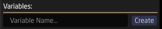 There are two types of variable: Range and Options.
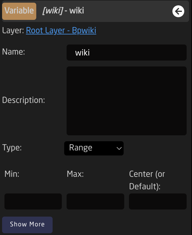
A range variable is to be used with any number value from X to Y defined by the user.
An options variable is to be used with any defined text string with independently set labels.
Event Scripts
More details coming soon
Tree (Advanced)
coming soon
Raw JSON Editor (Most Advanced)
The most advanced way to build or edit configurations would be via the full JSON editor. This is technically a different page from the Configuration page, however it is only accessible via the configuration page.
For users with a background in JSON, this could be the easiest and fastest way to work with our configurations. For most users, it is best to leave this section untouched as every character can effect the functionality of a configuration.
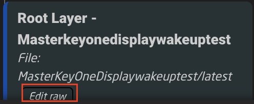
The JSON editor can be found by clicking on the Edit Raw links in the Tree on the layers with Include Files. The JSON available via these links is the Include File layers.
The JSON editor opens on its own web browser page. From here it is possible to do a few different things.
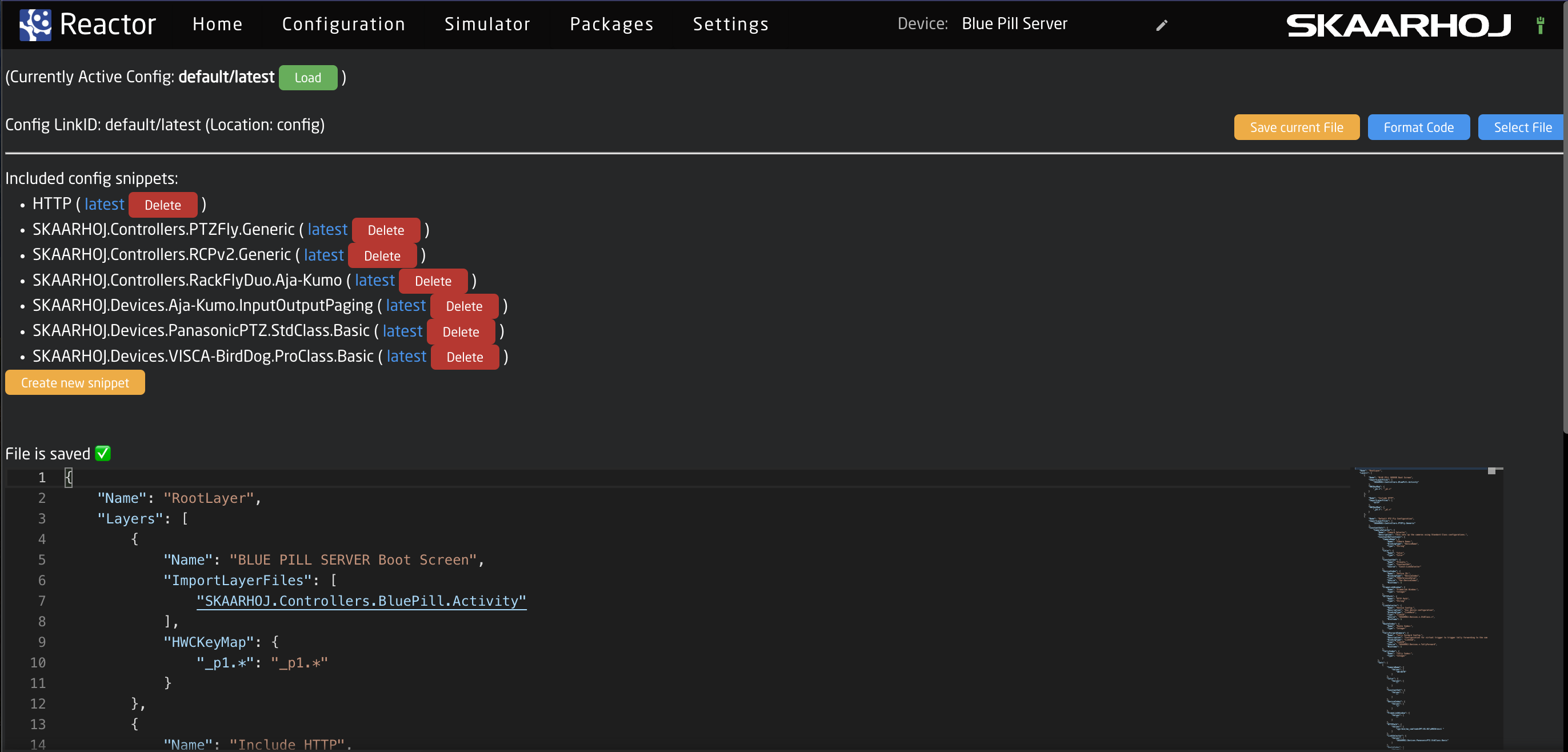
Taking a look at the top section of the page.

| Currently Active Config: | The name of the currently configuration file selected in the package. This can be shared on multiple different projects. |
| Config Link ID: | The selected link ID selected to edit. There can be multiple available per Currently Active Configuration on different layers in the tree. |
| Save Current File: | Save the current text in the JSON editor. |
| Format Code: | Format code for better layout on the page. |
| Select File: | Allows for the selection of a different configuration file to load into the currently selected layer that has an include layer. See image below. |
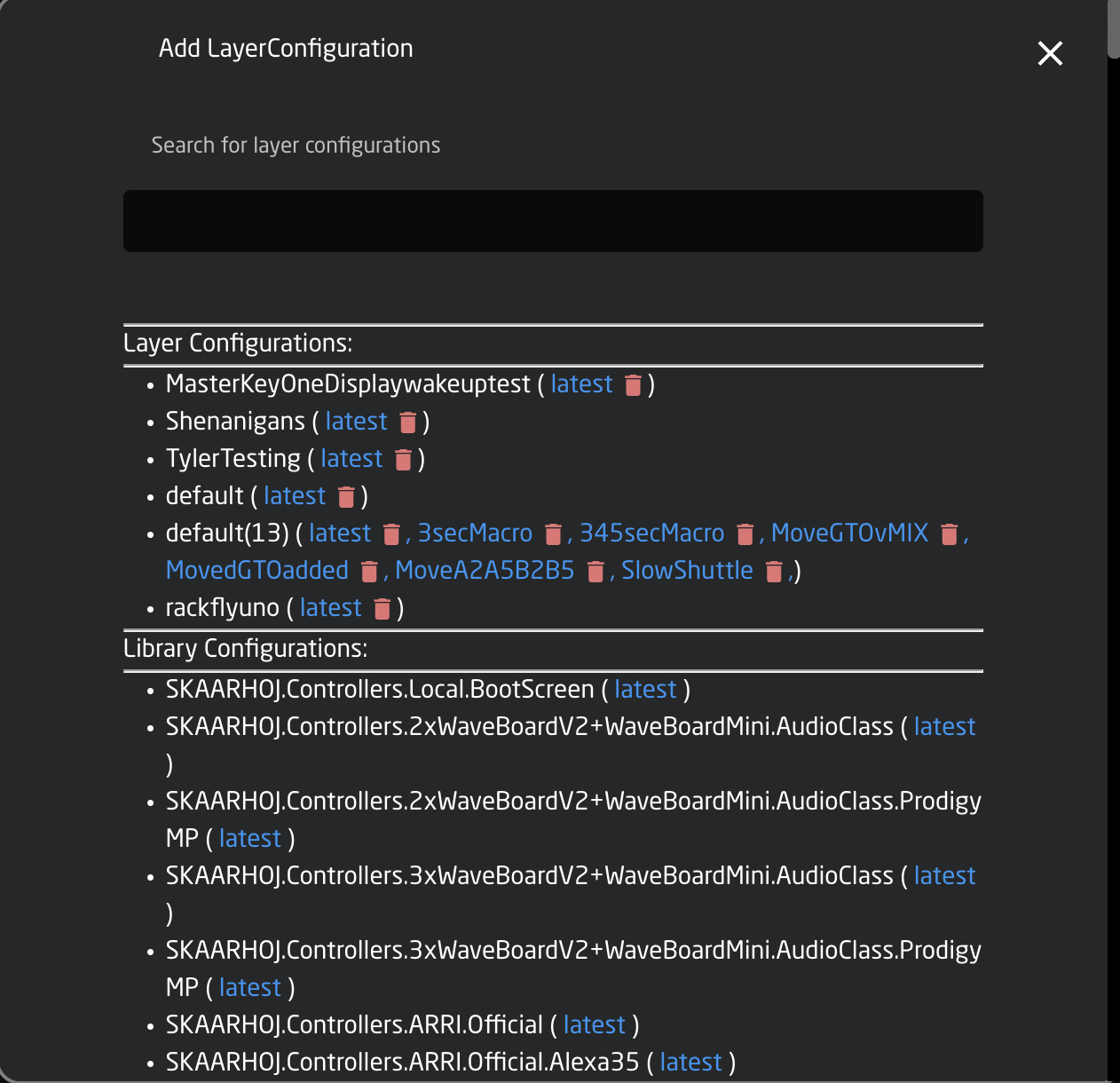
| Layer Configurations | Configuration files available on the Blue Pill device |
| Library Configurations | Configuration files available from Skaarhoj |
The middle section of the page contains the available different Snippets or include files within the selected configuration.
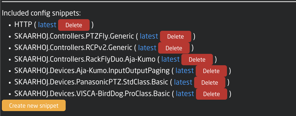
| Snippet Name | The include file name for that specific snippet. |
| Latest | Loads the latest version of the snippet into the JSON editor |
| Delete | Deletes the snippet |
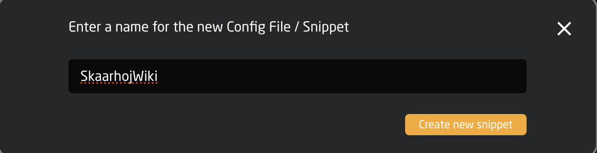
| Create new snippet | Allow for the creation of a new snippet file. See image below. |
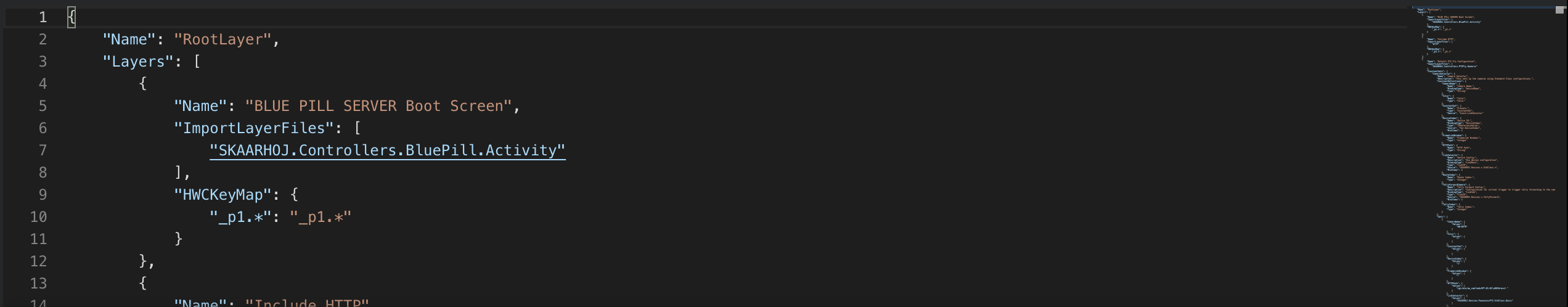
The bottom section is the JSON editor tool. Each line is numbered for easy reference and differentiation. The right hand side of the editor is a miniature version of the editor to quickly jump down to different sections for navigation.
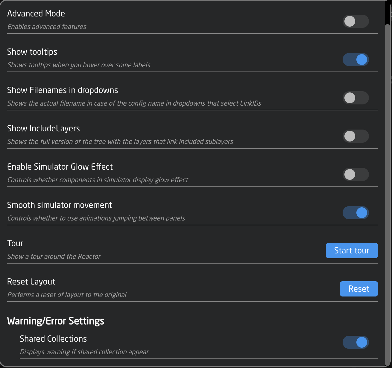
Settings Tools
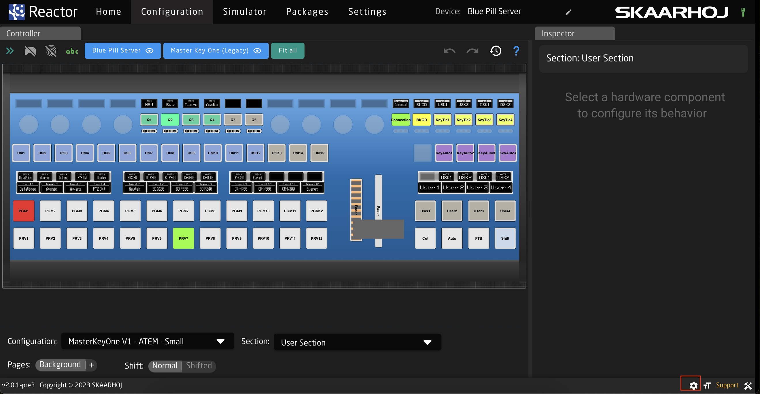
Located in the Settings on the Configuration page are some tools for use when working on the configuration page.
These tools can be opened by click on the cog wheel in the lower right corner of the page.
The available tools are as follows: